
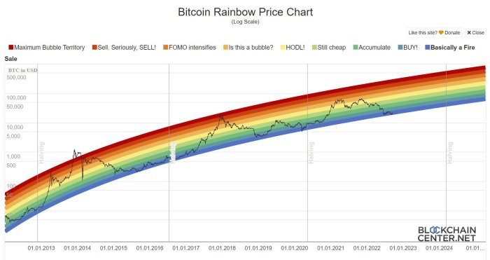
Bitcoin Rainbow Chart
The Bitcoin Rainbow Chart is a popular visual tool used to gauge the potential long-term value of Bitcoin. Unlike charts that focus on short-term price fluctuations, the Rainbow Chart provides a broader perspective on Bitcoin’s price trajectory, aiming to identify potential buy and sell zones based on historical price trends and logarithmic growth patterns. It’s important to understand that it’s not a predictive tool in the strictest sense, but rather a visual aid for interpreting long-term trends.
The chart’s visual representation consists of a series of colored bands, each representing a different price range. These bands are calculated using a logarithmic scale, reflecting Bitcoin’s historical growth pattern. The colors are typically arranged from red (representing severely undervalued prices) through orange, yellow, green, blue, and finally indigo (representing severely overvalued prices). The underlying principle is that Bitcoin’s price tends to cycle through these bands over time, offering potential insights into whether the current price is relatively high or low compared to its historical performance. The color-coding simplifies the interpretation, making it easier to visually assess the current market position relative to past cycles.
Historical Accuracy and Limitations of the Bitcoin Rainbow Chart
While the Bitcoin Rainbow Chart has shown some correlation with past price movements, it’s crucial to acknowledge its limitations. Its accuracy is not perfect, and it shouldn’t be solely relied upon for making investment decisions. The chart’s effectiveness is based on the assumption that Bitcoin’s price will continue to follow a similar logarithmic growth pattern in the future. However, external factors like regulatory changes, technological advancements, and overall market sentiment can significantly impact Bitcoin’s price, potentially deviating from the chart’s projections. For example, during the 2017 bull run, the price briefly exceeded the indigo band, a level the chart indicated as extremely overvalued, before experiencing a significant correction. This highlights that while the chart can be a useful tool for long-term perspective, it’s not foolproof and should be considered alongside other forms of market analysis.
Interpreting the Chart in Different Market Conditions
Let’s consider a hypothetical scenario. Imagine the Bitcoin price is currently in the yellow band. This would generally be interpreted as a relatively neutral price point, neither significantly undervalued nor overvalued. A trader might adopt a “wait-and-see” approach, observing market trends and looking for further confirmation signals before making significant investment decisions. Conversely, if the price falls into the red band, it might be seen as a potentially strong buying opportunity, according to the chart’s interpretation. However, even in this scenario, careful consideration of broader market conditions and risk tolerance is paramount. Similarly, if the price enters the indigo band, it might signal a potential sell opportunity, but the risk of missing further gains would need to be weighed against the risk of a price correction. It’s vital to remember that the chart provides a long-term perspective, and short-term volatility can significantly affect the price, leading to temporary deviations from the bands. The Rainbow Chart should therefore be used as one factor among many in a broader investment strategy, not as the sole determinant of buying or selling decisions.
Understanding the Blum Code within the Bitcoin Rainbow Chart: Bitcoin Rainbow Chart Blum Code
The Bitcoin Rainbow Chart is a popular long-term Bitcoin price prediction tool. While it doesn’t explicitly utilize a “Blum Code” in the traditional cryptographic sense, the chart’s construction relies on a specific mathematical model to generate its logarithmic bands. Understanding this model is crucial to interpreting the chart’s implications and limitations.
Mathematical Model of the Bitcoin Rainbow Chart Bands
The Rainbow Chart’s bands are generated using a logarithmic scale and a set of pre-defined price targets. These targets are not derived from a complex algorithm or statistical model but rather from a simplified logarithmic progression, reflecting the historical growth pattern of Bitcoin’s price. The bands represent different price levels corresponding to varying degrees of overbought or oversold conditions based on the historical context. The chart doesn’t use any sophisticated statistical forecasting models like ARIMA or GARCH, nor does it incorporate machine learning algorithms. Instead, it relies on a visual representation of price movements within a logarithmic framework. The bands are essentially smoothed logarithmic curves, calculated using a formula that incorporates the initial Bitcoin price and the growth rate implicit in the band’s design. The specific formula is not publicly available, but its essence lies in fitting a smooth curve to historical data, extrapolated into the future.
Biases and Assumptions Embedded in the Chart’s Construction
The Bitcoin Rainbow Chart inherently incorporates several biases and assumptions. Firstly, it assumes that Bitcoin’s price will continue to follow a logarithmic growth trajectory, a significant assumption given the volatility of cryptocurrency markets. This assumption may not hold true in the long term, especially if external factors significantly impact the market. Secondly, the chart’s bands are static and don’t adapt to changing market conditions. New information, technological advancements, or regulatory changes are not factored into the chart’s projections. This static nature limits its ability to capture short-term fluctuations and unexpected market events. Finally, the choice of the logarithmic scale itself introduces a bias, as logarithmic scales tend to compress large price movements and amplify smaller ones. This can lead to misinterpretations of price trends.
Comparison with Other Technical Analysis Tools
The Bitcoin Rainbow Chart differs significantly from other technical analysis tools like moving averages, Relative Strength Index (RSI), or Bollinger Bands. While these tools focus on short-term price movements and momentum, the Rainbow Chart is explicitly designed for long-term price prediction. Unlike moving averages which are calculated using recent price data, the Rainbow Chart’s bands are static, providing a long-term perspective irrespective of short-term volatility. It lacks the sensitivity to recent price changes found in RSI or the dynamic bandwidth adjustments seen in Bollinger Bands. Its strength lies in providing a simplified visual representation of long-term price targets, while its weakness is its inability to capture short-term trends or adapt to rapidly changing market conditions.
Comparison of Bitcoin Price Prediction Methods
| Method | Time Horizon | Data Used | Advantages | Disadvantages |
|---|---|---|---|---|
| Bitcoin Rainbow Chart | Long-term | Historical Bitcoin price | Simple visualization, long-term perspective | Static, ignores short-term fluctuations, assumes logarithmic growth |
| Moving Averages | Short-to-medium term | Recent Bitcoin price | Identifies trends, smooths out noise | Lagging indicator, susceptible to manipulation |
| RSI | Short-to-medium term | Price momentum | Identifies overbought/oversold conditions | Can generate false signals, parameter-sensitive |
| Bollinger Bands | Short-to-medium term | Price volatility | Identifies price extremes, volatility changes | Parameter-sensitive, can generate false signals |
Bitcoin Rainbow Chart’s Predictive Power
The Bitcoin Rainbow Chart, while visually appealing and intuitively understandable, isn’t a crystal ball. Its predictive power is a subject of ongoing debate among cryptocurrency enthusiasts and analysts. Understanding its historical performance, both successes and failures, is crucial for a realistic assessment of its utility. This section will critically evaluate the chart’s ability to forecast Bitcoin’s price movements.
Historical Performance Overview
The Bitcoin Rainbow Chart’s accuracy in predicting past Bitcoin price movements has been mixed. While it has shown instances of remarkable alignment with actual price trends, there have also been periods where its predictions have significantly deviated from reality. The chart’s success is often attributed to its logarithmic scale and the inherent long-term cyclical nature of Bitcoin’s price action, which aligns with the chart’s underlying assumptions. However, the chart’s simplicity and lack of consideration for short-term market fluctuations are its primary weaknesses. It’s important to remember that the chart is not a precise tool, but rather a long-term trend indicator.
Examples of Accurate and Inaccurate Predictions
The Rainbow Chart correctly predicted the general trajectory of Bitcoin’s price during several bull and bear cycles. For instance, the chart accurately signaled the bottom of the 2018-2019 bear market, suggesting a potential price rebound. Conversely, the chart’s predictions during periods of extreme market volatility, such as the flash crash in March 2020 or the rapid price surge in late 2021, were less accurate. The chart failed to fully capture the speed and magnitude of these abrupt price swings, highlighting its limitations in predicting short-term price movements. These discrepancies demonstrate the chart’s reliance on broader long-term trends rather than immediate price fluctuations.
Factors Influencing Accuracy
Several factors influence the Rainbow Chart’s accuracy. Market volatility, driven by factors like regulatory announcements, technological advancements, or macroeconomic events, can significantly affect Bitcoin’s price and lead to deviations from the chart’s predictions. External events, such as the collapse of FTX in late 2022, create unforeseen market shocks that the Rainbow Chart, which is based on historical data and long-term trends, cannot easily anticipate. Additionally, the chart’s inherent simplicity means it doesn’t incorporate other crucial factors that influence price, such as trading volume, social sentiment, or network activity.
Comparative Analysis with Other Models
Compared to more sophisticated quantitative models, such as those using machine learning or technical indicators, the Rainbow Chart’s predictive power is relatively limited. Complex algorithms often incorporate a wider range of data points and can adapt to changing market conditions more effectively. However, these sophisticated models are often complex, require significant computational power, and can be prone to overfitting. The Rainbow Chart’s simplicity offers a distinct advantage in its ease of understanding and interpretation. It provides a useful visual representation of long-term price trends, even if it lacks the precision of more complex models. Ultimately, the choice between using the Rainbow Chart and other prediction models depends on the user’s specific needs and risk tolerance. While the Rainbow Chart offers a useful long-term perspective, it should not be considered a standalone predictive tool.
Practical Applications and Limitations of the Bitcoin Rainbow Chart
The Bitcoin Rainbow Chart, while visually appealing and intuitively understandable, is not a standalone crystal ball for predicting Bitcoin’s price. Its value lies in providing a long-term perspective and context for price fluctuations, helping investors manage expectations and avoid impulsive decisions based on short-term volatility. Understanding its limitations is crucial for responsible integration into a broader investment strategy.
Integrating the Bitcoin Rainbow Chart into a Broader Investment Strategy
The Rainbow Chart serves best as a supplementary tool within a diversified portfolio. It shouldn’t dictate all investment choices, but rather inform the timing and allocation of Bitcoin within a larger asset mix. For example, an investor might use the chart to identify potential buy opportunities when the price falls into the “buy” zones, but only allocate a percentage of their overall investment portfolio to Bitcoin, mitigating potential losses. This approach allows investors to leverage the chart’s long-term perspective without exposing themselves to excessive risk. The strategy should also consider factors such as risk tolerance, investment goals, and overall market conditions. A well-rounded strategy would incorporate fundamental analysis (assessing Bitcoin’s underlying technology and adoption rate) and technical indicators beyond the Rainbow Chart for a more comprehensive view.
Risks and Limitations of Sole Reliance on the Bitcoin Rainbow Chart
Relying solely on the Rainbow Chart for investment decisions is risky. The chart’s simplicity, while beneficial for understanding long-term trends, ignores short-term market fluctuations and unforeseen events. For example, the chart may suggest a “buy” zone, but a sudden regulatory crackdown or a major security breach could significantly impact Bitcoin’s price, regardless of the chart’s prediction. Moreover, the chart’s logarithmic scale can distort the perception of price movements, potentially leading to misinterpretations. Finally, the chart’s historical accuracy is not guaranteed to predict future performance; past performance is not indicative of future results.
Using the Bitcoin Rainbow Chart with Other Technical Indicators
Combining the Rainbow Chart with other technical indicators, such as moving averages (e.g., 200-day MA), Relative Strength Index (RSI), or Bollinger Bands, can enhance predictive accuracy. For instance, if the Rainbow Chart suggests a “buy” zone and the RSI indicates oversold conditions, it strengthens the signal to enter a long position. Conversely, if the Rainbow Chart suggests a “buy” zone but the 200-day moving average is trending downwards, it might suggest caution or a wait-and-see approach. This multi-faceted analysis helps to confirm or refute the signals from the Rainbow Chart, reducing the risk of false signals.
A Step-by-Step Guide to Using the Bitcoin Rainbow Chart for Trading Decisions
This guide illustrates how to incorporate the Rainbow Chart into trading decisions while prioritizing risk management.
- Assess the Current Bitcoin Price: Locate the current Bitcoin price on the Rainbow Chart.
- Identify the Color Zone: Determine which color zone the current price falls into (e.g., “Buy,” “Hold,” “Sell”).
- Consult Other Technical Indicators: Analyze other relevant technical indicators (e.g., moving averages, RSI) to confirm or contradict the Rainbow Chart’s signal.
- Determine Risk Tolerance: Define your acceptable risk level before making any trading decisions. This might involve setting stop-loss orders to limit potential losses.
- Allocate Capital Wisely: Based on the combined analysis and risk tolerance, allocate a portion of your investment capital to Bitcoin. Avoid investing your entire portfolio based solely on the Rainbow Chart.
- Monitor and Adapt: Continuously monitor the market and the Rainbow Chart. Be prepared to adjust your strategy based on changing market conditions and new information.
Example: If the Rainbow Chart shows a price in the “Buy” zone, but the RSI is already in overbought territory, this might signal a potential short-term overvaluation, suggesting a more cautious approach or waiting for a price correction before entering a long position.
The Bitcoin Rainbow Chart and Market Sentiment
The Bitcoin Rainbow Chart, while not a direct measure of market sentiment, provides a valuable framework for understanding the prevailing mood among Bitcoin investors. By comparing the current Bitcoin price to the chart’s colored bands, we can infer whether the market is generally optimistic or pessimistic. This is because the chart’s bands represent historically significant price levels, and their relationship to the current price suggests whether the market is overbought, undervalued, or trading within a historically typical range.
The chart’s effectiveness in gauging sentiment stems from its ability to visually represent price levels associated with different phases of the market cycle. A price sitting well above the most optimistic bands (e.g., the bright yellow or red bands) might suggest extreme exuberance and potential overvaluation, indicative of a bullish but potentially unsustainable market sentiment. Conversely, a price deeply entrenched in the lower bands (e.g., the dark blue or purple bands) could signal widespread fear and potential undervaluation, reflecting a bearish sentiment.
Correlation with Other Sentiment Indicators
The Rainbow Chart’s signals can be meaningfully compared with other sentiment indicators to paint a more complete picture. For instance, a price in the overbought zone (upper bands) coinciding with high trading volume could suggest a potential market top, as high volume confirms the strength of the bullish sentiment. Conversely, a price in the undervalued zone (lower bands) with low trading volume might signal a lack of conviction even amidst a bearish sentiment, potentially suggesting a prolonged period of sideways trading or even a potential bounce. Similarly, a surge in positive social media mentions (e.g., increased tweets or forum posts expressing bullish views) alongside a price moving into the upper bands of the Rainbow Chart would strongly reinforce the bullish sentiment interpretation. Conversely, a high volume of negative sentiment on social media coupled with a price in the lower bands would support the bearish narrative.
Influence of Psychological Factors
The effectiveness of the Bitcoin Rainbow Chart in reflecting market sentiment is heavily influenced by psychological factors. Fear and greed, two primary drivers of market behavior, play a significant role. When the price is in the upper bands, greed can lead to excessive buying, pushing the price even higher, potentially creating a bubble. Conversely, when the price is in the lower bands, fear can cause panic selling, further depressing the price. These emotional responses can amplify the chart’s signals, sometimes leading to self-fulfilling prophecies. For example, a price significantly above the highest band might trigger profit-taking by investors, leading to a price correction regardless of any underlying fundamental factors. Similarly, a price deeply entrenched in the lower bands might attract bargain hunters, leading to a price recovery, even if fundamental factors remain bearish.
Visual Representation of the Relationship
Imagine a graph with the Bitcoin Rainbow Chart bands plotted vertically. On the horizontal axis, we plot a composite market sentiment index, a hypothetical number derived from combining trading volume, social media sentiment, and other relevant indicators. A higher number indicates stronger bullish sentiment, and a lower number indicates stronger bearish sentiment. We can then plot the Bitcoin price as a data point on this graph. If the price is high (in the upper bands) and the sentiment index is also high, this would indicate strong confirmation of a bullish market. If the price is low (in the lower bands) and the sentiment index is low, this would show a strong confirmation of a bearish market. However, discrepancies between the chart’s price position and the sentiment index (e.g., high price but low sentiment) might indicate an unsustainable market condition or a divergence that could lead to a future price correction. The visual representation shows a strong positive correlation between the Rainbow Chart’s price levels and the overall market sentiment, but with the caveat that emotional factors can sometimes cause short-term deviations from this correlation.
Frequently Asked Questions (FAQ)
This section addresses common queries regarding the Bitcoin Rainbow Chart, clarifying its nature, accuracy, and practical applications. Understanding these points is crucial for anyone considering using this tool for analyzing Bitcoin’s price movements.
Bitcoin Rainbow Chart Definition
The Bitcoin Rainbow Chart is a long-term Bitcoin price prediction tool. It uses a logarithmic scale to plot Bitcoin’s price over time, overlaying colored bands that represent different price ranges and potential buy/sell signals. These bands are based on exponential moving averages, providing a visual representation of historical price trends and projected future price levels. It’s important to remember it’s a visual aid, not a precise predictive model.
Bitcoin Rainbow Chart Accuracy
The Bitcoin Rainbow Chart’s accuracy is debated. While it has shown some correlation with past Bitcoin price movements, it’s not a foolproof predictor of future prices. Its accuracy is limited by its reliance on historical data and the inherent volatility of the cryptocurrency market. Unexpected events, regulatory changes, or shifts in market sentiment can significantly impact Bitcoin’s price, rendering the chart’s predictions less reliable. For example, the 2021 bull run exceeded even the most optimistic projections on the chart, highlighting its limitations.
Bitcoin Rainbow Chart Origin
The exact origin of the Bitcoin Rainbow Chart is somewhat unclear, with several individuals claiming involvement in its development. However, it’s widely considered a community-created tool, evolving over time through user contributions and modifications. Its decentralized nature makes pinpointing a single creator difficult.
Blum Code and Bitcoin Rainbow Chart Relationship
There’s no known direct relationship between the Blum Blum Shub (Blum Code) pseudorandom number generator and the construction of the Bitcoin Rainbow Chart. The Rainbow Chart’s calculations are based on standard moving averages and logarithmic scaling, not cryptographic pseudorandom number generation techniques.
Bitcoin Rainbow Chart and Market Timing, Bitcoin Rainbow Chart Blum Code
Using the Bitcoin Rainbow Chart for precise market timing is risky. While the chart can offer a general sense of potential price support and resistance levels, it shouldn’t be used as the sole basis for buy/sell decisions. The cryptocurrency market is highly volatile and influenced by numerous factors beyond the scope of the chart. Relying solely on the chart for timing market entries and exits could lead to significant losses. Successful trading requires a holistic approach, combining technical analysis, fundamental analysis, and risk management strategies.
Understanding the Bitcoin Rainbow Chart Blum Code requires appreciating Bitcoin’s long-term price trends. This cyclical nature is fascinating, and its implications are further explored in upcoming documentaries. For instance, you might find additional context by checking the release date of the HBO Bitcoin documentary, available here: Hbo Bitcoin Documentary Release Date. Ultimately, the Rainbow Chart and documentaries like this help to contextualize the volatility inherent in Bitcoin’s price movements.
Understanding the Bitcoin Rainbow Chart Blum Code requires considering the cyclical nature of Bitcoin’s price. A key element influencing these cycles is the Bitcoin halving, which significantly impacts supply and, consequently, price. To understand the timing of these crucial events, check out this resource on When Is The Bitcoin Halving. Knowing the halving schedule allows for more informed interpretations of the Bitcoin Rainbow Chart Blum Code’s predictions.
Understanding the Bitcoin Rainbow Chart Blum Code requires grasping the underlying principles of Bitcoin’s price volatility. For a deeper dive into Bitcoin’s enigmatic nature, I recommend checking out the insightful article, Money Electric: The Bitcoin Mystery , which explores the broader context of Bitcoin’s evolution. Returning to the Rainbow Chart, its logarithmic scale helps visualize long-term price trends, offering a valuable perspective for interpreting the Blum Code’s predictions.
Understanding the Bitcoin Rainbow Chart Blum Code requires considering long-term trends. To accurately assess its current implications, it’s helpful to check the live market data by looking at the Price Of Bitcoin Today. This allows for a more informed interpretation of where Bitcoin’s price sits within the historical context provided by the Rainbow Chart, ultimately aiding in better predictions based on this established model.
Understanding the Bitcoin Rainbow Chart Blum Code requires grasping the fundamentals of Bitcoin’s value proposition. A key element of this is the scarcity driven by the mining process; to learn more about this crucial aspect, check out this resource on How Are Bitcoins Mined. This knowledge is essential for interpreting the implications of the Rainbow Chart and its predictions regarding future Bitcoin prices.