
Real-Time Bitcoin Charts
Understanding the fluctuating price of Bitcoin is crucial for both traders and investors aiming to navigate the cryptocurrency market effectively. Real-time Bitcoin charts provide a dynamic visual representation of price movements, allowing users to make informed decisions based on current market trends. These charts offer a critical edge, enabling swift reactions to market shifts and opportunities that might otherwise be missed.
Real-time Bitcoin charts are essential tools for monitoring the cryptocurrency’s price and volume, providing a visual representation of market sentiment and potential trading opportunities. Their value lies in their immediacy, allowing traders to observe price changes as they happen and respond accordingly. Investors, on the other hand, use these charts to track long-term trends and assess the overall health of the Bitcoin market.
Types of Real-Time Bitcoin Charts
Several chart types effectively visualize Bitcoin price data. Each offers a unique perspective, catering to different trading styles and analytical approaches. The choice of chart depends largely on the individual trader’s preference and the specific information they are seeking to extract.
Candlestick Charts
Candlestick charts are widely popular among traders due to their comprehensive display of price information within each individual candlestick. Each candlestick represents a specific time period (e.g., one hour, one day) and visually shows the opening price, closing price, high price, and low price. A green candlestick indicates a closing price higher than the opening price (a bullish signal), while a red candlestick shows the opposite (a bearish signal). The body of the candlestick represents the price range between the open and close, while the wicks (or shadows) extend to the high and low prices of the period. The length and color of the candlesticks provide valuable insights into the strength and direction of price movements.
Line Charts
Line charts offer a simpler representation of price movements, connecting the closing prices of consecutive time periods with a continuous line. While less detailed than candlestick charts, line charts are excellent for identifying overall trends and spotting significant price changes over longer periods. They are often preferred for visualizing long-term trends and identifying potential support and resistance levels. The simplicity of line charts makes them ideal for quickly assessing the general direction of the Bitcoin price.
Bar Charts
Bar charts are similar to candlestick charts but instead of candlesticks, they use vertical bars to represent the price range for a specific period. The height of the bar represents the price range, with the open and close prices often marked within the bar itself. Similar to candlestick charts, bar charts show the opening, closing, high, and low prices for each period, although the visual representation is slightly less nuanced.
Key Elements of a Real-Time Bitcoin Chart
Understanding the components of a real-time Bitcoin chart is fundamental to its effective interpretation. These elements work together to provide a holistic picture of market activity.
Price
The price axis (usually vertical) displays the Bitcoin price in a chosen currency (e.g., USD, EUR). This is the most fundamental element, showing the value of Bitcoin at any given time.
Volume
The volume axis (usually below the price axis) shows the trading volume for each time period. High volume typically indicates significant market activity, often associated with strong price movements. Low volume might suggest a lack of conviction in the price direction.
Time
The time axis (usually horizontal) represents the time periods displayed on the chart. This can range from seconds or minutes to days, weeks, or months, allowing for analysis of short-term volatility and long-term trends. The selection of the time frame significantly impacts the interpretation of the chart.
Understanding Bitcoin Price Fluctuations
Bitcoin’s price is notoriously volatile, experiencing significant swings in value over short periods. Understanding the factors driving these fluctuations is crucial for anyone involved in the cryptocurrency market, whether as an investor, trader, or simply an interested observer. This volatility stems from a complex interplay of market forces, news events, and regulatory actions.
Bitcoin’s price volatility is a defining characteristic, setting it apart from more traditional asset classes. Several key factors contribute to this inherent instability.
Market Sentiment and Speculation
Market sentiment plays a dominant role in Bitcoin’s price movements. Positive news, such as adoption by major corporations or positive regulatory developments, tends to drive prices upward, fueling investor enthusiasm and speculation. Conversely, negative news, regulatory crackdowns, or security breaches can trigger sharp price drops as investors sell off their holdings. This is amplified by the relatively small size of the Bitcoin market compared to traditional markets, making it more susceptible to large price swings driven by relatively small trading volumes. For example, Elon Musk’s tweets about Bitcoin have historically been shown to significantly impact its price, demonstrating the power of market sentiment and the influence of key figures.
News Events and Regulatory Actions
Significant news events, both positive and negative, can have a profound impact on Bitcoin’s price. Regulatory announcements from governments around the world significantly influence investor confidence. Positive regulatory developments, such as the clarification of legal frameworks or the approval of Bitcoin ETFs, can lead to price increases. Conversely, negative news, such as government crackdowns on cryptocurrency exchanges or increased scrutiny of Bitcoin’s use in illicit activities, can trigger substantial price declines. For instance, China’s ban on cryptocurrency trading in 2021 led to a significant drop in Bitcoin’s price.
Comparison to Other Asset Classes, Gráfico Bitcoin Tiempo Real
Compared to traditional asset classes like stocks and gold, Bitcoin exhibits significantly higher volatility. Stocks, while subject to market fluctuations, generally experience less dramatic price swings than Bitcoin. Gold, often considered a safe haven asset, tends to be less volatile than both stocks and Bitcoin. This higher volatility is partly due to Bitcoin’s relative youth as an asset class, its decentralized nature, and the lack of established regulatory frameworks compared to traditional markets. The lack of a physical underlying asset also contributes to its higher volatility, as compared to gold.
Technical Analysis and Price Prediction
Technical analysis, a method of evaluating investments by analyzing past market data, plays a significant role in attempting to predict Bitcoin’s price movements. Technical analysts study charts and graphs to identify trends, support and resistance levels, and other patterns that may indicate future price direction. However, it’s crucial to acknowledge that technical analysis is not a foolproof method, and predictions based on it are not guaranteed. While technical indicators can provide insights into potential price movements, they should be used in conjunction with fundamental analysis and a thorough understanding of market dynamics. The effectiveness of technical analysis in predicting Bitcoin’s price is often debated, with some arguing that its high volatility makes accurate predictions extremely challenging.
Choosing the Right Real-Time Bitcoin Chart
Selecting the appropriate real-time Bitcoin charting platform is crucial for effective trading and market analysis. The right platform will provide accurate data, powerful analytical tools, and a user-friendly interface, ultimately enhancing your decision-making process. A poorly chosen platform can lead to inaccurate insights and potentially costly mistakes.
Factors to Consider When Selecting a Bitcoin Charting Platform
Choosing a Bitcoin charting platform involves careful consideration of several key features. Data accuracy is paramount; unreliable data can lead to flawed analyses and poor trading decisions. The availability of robust charting tools, including indicators and drawing tools, is also essential for in-depth market analysis. Finally, a user-friendly interface ensures ease of navigation and efficient use of the platform’s features. A platform with a cluttered or poorly designed interface can hinder analysis and trading.
Comparison of Popular Real-Time Bitcoin Charting Platforms
Several platforms offer real-time Bitcoin charts, each with its strengths and weaknesses. TradingView, Coinbase, and Binance are among the most popular choices. Each offers a different set of features and caters to various user needs and experience levels. A direct comparison highlights the key differences and helps in making an informed choice.
Key Features Comparison of Popular Platforms
| Platform Name | Data Accuracy | Charting Tools | User Interface Rating |
|---|---|---|---|
| TradingView | Generally considered highly accurate, drawing from multiple exchanges. | Extensive range of technical indicators, drawing tools, and customizable chart types. Offers scripting capabilities for advanced users. | Highly rated; intuitive and customizable, catering to both beginners and advanced traders. |
| Coinbase | Data accuracy is generally reliable, reflecting Coinbase’s own exchange data. | Offers a solid selection of charting tools, though less extensive than TradingView. Focus is on simplicity and ease of use. | User-friendly interface, suitable for beginners. Less customizable than TradingView. |
| Binance | Data accuracy is generally reliable, reflecting Binance’s own exchange data. | Provides a comprehensive suite of charting tools, comparable to TradingView in terms of functionality. | Interface can be considered more complex than Coinbase, requiring some familiarity with trading platforms. |
Interpreting Real-Time Bitcoin Chart Data
Understanding real-time Bitcoin chart data requires familiarity with candlestick patterns and technical indicators. By combining these tools, traders can gain insights into potential price movements and identify opportunities. This section will guide you through the process of interpreting this data, focusing on practical application.
Candlestick Pattern Interpretation
Candlestick patterns are visual representations of price action over a specific period. Each candlestick shows the open, high, low, and closing prices. Analyzing these patterns helps identify potential price reversals or continuations. Understanding the context of these patterns within the broader market trend is crucial for accurate interpretation.
- Bullish Candlestick Patterns: These suggest a potential price increase. Examples include the Hammer, indicating a possible bottom, and the Engulfing Pattern, where a larger bullish candle follows a bearish one, signaling a potential bullish reversal.
- Bearish Candlestick Patterns: These suggest a potential price decrease. Examples include the Hanging Man, often appearing at the top of an uptrend, suggesting a potential reversal, and the Dark Cloud Cover, a bearish reversal pattern similar to the Engulfing pattern but indicating a bearish reversal.
- Neutral Candlestick Patterns: These offer less clear directional signals. Examples include Doji, indicating indecision in the market, and Spinning Top, which is a small candle body with long wicks, implying a struggle between buyers and sellers.
Moving Averages and Technical Indicators
Moving averages smooth out price fluctuations, helping identify trends. Commonly used moving averages include simple moving averages (SMA) and exponential moving averages (EMA). Technical indicators, such as the Relative Strength Index (RSI) and the Moving Average Convergence Divergence (MACD), provide additional insights into momentum and potential overbought or oversold conditions.
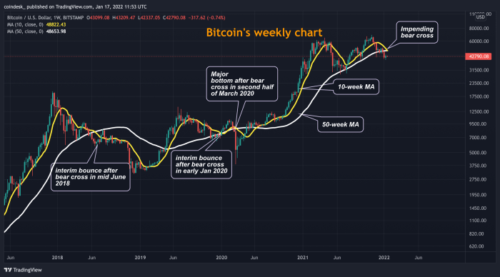
- Moving Average Crossover: When a shorter-term moving average crosses above a longer-term moving average (e.g., a 50-day SMA crossing above a 200-day SMA), it’s often interpreted as a bullish signal, suggesting a potential uptrend. The opposite (a shorter-term moving average crossing below a longer-term moving average) is often considered a bearish signal.
- RSI and Overbought/Oversold Conditions: The RSI is an oscillator that measures the magnitude of recent price changes to evaluate overbought or oversold conditions. Generally, an RSI above 70 is considered overbought, suggesting a potential price correction, while an RSI below 30 is considered oversold, suggesting a potential price rebound. However, it’s crucial to remember that these levels are not strict rules and can vary depending on the asset and market conditions.
- MACD and Momentum Shifts: The MACD is a trend-following momentum indicator that shows the relationship between two moving averages. A bullish crossover (the MACD line crossing above the signal line) can signal a potential uptrend, while a bearish crossover (the MACD line crossing below the signal line) can signal a potential downtrend. Divergences between the MACD and price action can also provide valuable insights into potential trend reversals.
Example: Identifying a Potential Trading Opportunity
Imagine a scenario where the Bitcoin price is showing a bearish engulfing pattern on a daily chart, coupled with an RSI below 30 and a MACD showing a bullish crossover. This combination suggests a potential buying opportunity, as the bearish pattern might be a temporary dip within a larger uptrend, supported by oversold conditions and a shift in momentum. However, it’s crucial to remember that this is just one example and a thorough risk assessment is always necessary before making any trading decisions. This example highlights the importance of combining different indicators for a more comprehensive analysis.
Risk Management and Trading Strategies
Successful Bitcoin trading hinges on a robust understanding and implementation of risk management techniques. The volatile nature of the cryptocurrency market necessitates careful planning and execution to protect capital and maximize potential profits. Ignoring risk management can lead to significant losses, even with accurate market analysis.
The importance of risk management in Bitcoin trading cannot be overstated. Bitcoin’s price is notoriously susceptible to sharp and unpredictable swings, driven by factors ranging from regulatory announcements to social media trends. Without a well-defined risk management plan, even a seemingly sound trading strategy can quickly unravel, resulting in substantial financial losses. A disciplined approach protects against emotional decision-making during market volatility.
Risk Management Techniques
Effective risk management involves a combination of strategies designed to limit potential losses. These techniques help traders to control their exposure to risk and prevent catastrophic events. Implementing these methods requires discipline and a clear understanding of one’s risk tolerance.
Gráfico Bitcoin Tiempo Real – Stop-loss orders automatically sell a Bitcoin position when the price falls to a predetermined level. This limits potential losses by preventing further downward movement from impacting the trader’s capital. For example, a trader buying Bitcoin at $30,000 might set a stop-loss order at $28,000, ensuring they won’t lose more than $2,000 per Bitcoin if the price drops. This strategy protects against unforeseen market downturns.
Monitoring a Gráfico Bitcoin Tiempo Real provides a dynamic view of the cryptocurrency’s price fluctuations. Understanding these shifts is crucial before investing, and that’s why learning how to safely purchase Bitcoin is vital. For those in India, a helpful guide is available at How To Buy Bitcoin In India , offering insights into the process. Armed with this knowledge, you can then more effectively interpret your Gráfico Bitcoin Tiempo Real and make informed decisions.
Position sizing dictates the amount of capital allocated to each trade. This involves calculating the appropriate investment size based on the trader’s risk tolerance and the potential reward of the trade. For instance, a trader with a $10,000 portfolio might allocate only 1% or $100 to a single trade, limiting their potential loss to $100 even if the trade goes completely against them. This approach prevents a single losing trade from severely impacting the entire portfolio.
Monitoring a Gráfico Bitcoin Tiempo Real provides a dynamic view of the cryptocurrency’s price fluctuations. Before making any investment decisions, however, it’s crucial to carefully consider the factors discussed in this comprehensive guide: Should I Buy Bitcoin. Understanding these factors will help you interpret the information presented in a Gráfico Bitcoin Tiempo Real more effectively and make informed choices.
Sample Trading Strategy
This example combines real-time chart analysis with risk management techniques. It is a simplified illustration and should not be considered financial advice.
Strategy: This strategy focuses on identifying short-term price movements using real-time charts. It utilizes moving averages (e.g., 50-day and 200-day) to identify potential trend reversals. The trader will enter a long position when the shorter moving average crosses above the longer moving average, suggesting a bullish trend. Conversely, a short position will be taken when the shorter moving average crosses below the longer moving average, indicating a bearish trend.
Monitoring a Gráfico Bitcoin Tiempo Real provides a dynamic view of the cryptocurrency’s price fluctuations. Understanding these shifts often involves considering past events that influenced Bitcoin’s value, such as the impact of the last halving event; you can find details on the exact date at Last Bitcoin Halving Date. Observing the real-time chart in conjunction with this historical data offers a more complete picture for interpreting current trends in the Gráfico Bitcoin Tiempo Real.
Risk Management: A stop-loss order will be placed below the recent swing low for long positions and above the recent swing high for short positions. Position sizing will be limited to 1% of the total trading capital per trade. This means that even if a trade results in a complete loss, the trader will only lose 1% of their capital. This approach ensures that losses are manageable and will not wipe out the entire portfolio.
Monitoring the Gráfico Bitcoin Tiempo Real provides valuable insights into market fluctuations. Understanding these changes can help you make informed decisions, especially when considering purchasing Bitcoin. If you’re ready to invest, finding the easiest way to buy Bitcoin is crucial; check out this resource for guidance: Easiest Way To Buy Bitcoin. Then, you can return to the Gráfico Bitcoin Tiempo Real to track your investment’s progress.
Example: Let’s say a trader observes a bullish crossover on the 50-day and 200-day moving averages. The recent swing low is $29,000. The trader enters a long position, placing a stop-loss order at $28,000. With a $10,000 trading account, the position size is limited to $100, representing 1% of the total capital. If the price drops to the stop-loss level, the loss will be limited to $100.
Monitoring a Gráfico Bitcoin Tiempo Real provides a dynamic view of the cryptocurrency’s price fluctuations. Understanding these movements is crucial, especially considering the question many investors ponder: to find out more, check this insightful article Is Bitcoin Going To Crash. Ultimately, the real-time chart remains the most immediate indicator of Bitcoin’s current market behavior, informing decisions based on observed trends.
Beyond the Charts
While real-time Bitcoin charts offer a dynamic view of price movements, understanding the broader economic context is crucial for informed investment decisions. Ignoring macroeconomic factors and potential risks can lead to significant losses. Therefore, a comprehensive approach necessitates considering elements beyond the immediate price fluctuations visible on charts.
Macroeconomic factors significantly influence Bitcoin’s price. Global economic events, such as inflation, recessionary fears, and geopolitical instability, often impact investor sentiment and capital flows, directly affecting the cryptocurrency market. For example, periods of high inflation can drive investors towards Bitcoin as a hedge against currency devaluation, leading to price increases. Conversely, a global recession might cause investors to liquidate assets, including Bitcoin, to cover losses in other investments, resulting in price drops. Government regulations and central bank policies also play a crucial role. Stringent regulations can dampen investor enthusiasm, while supportive policies can foster growth.
Macroeconomic Influences on Bitcoin Price
The relationship between Bitcoin’s price and macroeconomic factors is complex and not always linear. However, several key indicators consistently demonstrate correlation. For instance, a rise in inflation often correlates with increased Bitcoin adoption as investors seek alternative stores of value. Similarly, periods of uncertainty in traditional financial markets can lead to a flight to safety, with Bitcoin sometimes benefiting from this capital inflow. Conversely, negative economic news or tighter monetary policies from central banks can negatively impact Bitcoin’s price, as investors may prefer more stable assets. Analyzing these macroeconomic indicators alongside technical chart analysis provides a more holistic perspective on Bitcoin’s price trajectory.
Risks Associated with Bitcoin Investment
Investing in Bitcoin carries inherent risks. Volatility is a primary concern; Bitcoin’s price can experience significant swings in short periods. This volatility is amplified by factors such as regulatory uncertainty, market manipulation, and security breaches. Furthermore, the relatively nascent nature of the cryptocurrency market means it’s susceptible to unforeseen events and technological disruptions that could negatively impact its value. The lack of regulatory oversight in some jurisdictions also presents risks, increasing the potential for fraud and scams. Finally, the decentralized nature of Bitcoin, while a strength, also means that lost private keys result in irreversible loss of funds.
Importance of Due Diligence
Before investing in Bitcoin or any other cryptocurrency, thorough due diligence is paramount. This involves researching the asset’s fundamentals, understanding its technology, and assessing the associated risks. It’s crucial to evaluate the overall market sentiment, regulatory landscape, and the potential impact of macroeconomic factors. Understanding the technology behind Bitcoin, including blockchain technology and its security mechanisms, is vital. Furthermore, assessing the reputation and security of cryptocurrency exchanges is essential to mitigate the risk of fraud or hacking. Finally, diversifying investments and only investing what one can afford to lose are crucial risk management strategies. Ignoring these steps can lead to significant financial losses.
Frequently Asked Questions: Gráfico Bitcoin Tiempo Real
This section addresses common queries regarding the use and interpretation of real-time Bitcoin charts. Understanding these aspects is crucial for both novice and experienced traders to navigate the dynamic Bitcoin market effectively. Accurate interpretation and responsible use of charting tools are paramount for informed decision-making.
Benefits of Using Real-Time Bitcoin Charts
Real-time Bitcoin charts offer significant advantages for both short-term and long-term investors. For short-term traders, the immediate price updates enable quick responses to market fluctuations, allowing for timely entry and exit points to capitalize on short-term price movements. This is particularly useful for strategies involving day trading or scalping. Long-term investors, on the other hand, benefit from observing overarching trends and patterns, identifying potential support and resistance levels, and gauging the overall market sentiment. This helps in making informed decisions about buy and hold strategies, and adjusting investment approaches based on long-term market analysis. The ability to monitor price action in real-time provides a dynamic view of market sentiment and allows for more agile portfolio management.
Accuracy of Real-Time Bitcoin Price Charts
The accuracy of real-time Bitcoin price charts depends on several factors. Data aggregation methods employed by different exchanges can vary, leading to slight discrepancies. Network latency and the speed of data transmission also play a role. Furthermore, the sheer volume of transactions occurring simultaneously can cause temporary delays in updating price information. While reputable sources strive for high accuracy, it’s crucial to remember that displayed prices represent a snapshot in time and may not reflect the exact price at which a trade could be executed. Differences between exchanges, especially during periods of high volatility, are common and should be anticipated.
Common Mistakes to Avoid When Using Real-Time Bitcoin Charts
Over-reliance on chart patterns without considering fundamental analysis is a common pitfall. Charts can be misleading, and relying solely on technical indicators without understanding broader market trends or news events can lead to poor investment decisions. Another mistake is emotional trading based on short-term price fluctuations. Seeing immediate price drops can trigger panic selling, while rapid increases can lead to impulsive buying. Ignoring risk management strategies, such as setting stop-loss orders, is another frequent error that can lead to significant losses. Finally, neglecting to diversify your portfolio and concentrating investments solely based on chart analysis is a high-risk approach.
Reliable Sources for Real-Time Bitcoin Charts
Several reputable sources provide reliable real-time Bitcoin charts. TradingView, for instance, offers a comprehensive platform with a wide array of charting tools and technical indicators, along with community analysis. CoinMarketCap provides aggregated data from various exchanges, offering a broader perspective on Bitcoin’s price. Binance, Coinbase, and Kraken, among other major cryptocurrency exchanges, offer their own integrated charting tools, providing real-time data specific to their trading platforms. Each platform has its strengths; choosing the best one depends on individual needs and preferences, considering factors like interface, available tools, and data accuracy.
Visual Aids
Visual aids are crucial for understanding the often-complex dynamics of Bitcoin’s price movements. Clear visualizations can help translate raw data into actionable insights, making it easier to grasp key concepts and inform trading decisions. This section explores several visual representations that effectively illustrate important aspects of Bitcoin price behavior and trading strategies.
Candlestick Chart Anatomy
A candlestick chart is a fundamental tool for analyzing price action. Each candlestick represents a specific time period (e.g., one hour, one day), displaying the opening, high, low, and closing prices. The illustration below depicts a typical candlestick, highlighting these key elements.
Imagine a candlestick chart where each candlestick is rectangular with a body and wicks. The body of the candlestick represents the range between the opening and closing prices. A green (or white) candlestick indicates a closing price higher than the opening price (a bullish candle), while a red (or black) candlestick shows a closing price lower than the opening price (a bearish candle). Extending upwards from the body is the upper wick, showing the highest price reached during that period. Similarly, the lower wick extends downwards from the body, indicating the lowest price reached. The labels “Open,” “High,” “Low,” and “Close” would be clearly positioned on or near the relevant parts of the candlestick to indicate their corresponding price levels.
Bitcoin and Gold Price Volatility Comparison
This visual compares the price volatility of Bitcoin and gold over a defined period, for example, the last year. A line graph is ideal for this comparison. The x-axis represents time (e.g., daily or weekly intervals), and the y-axis represents the price. Two lines would be plotted: one for Bitcoin’s price and another for gold’s price. To enhance clarity, the lines could be differentiated by color (e.g., Bitcoin in blue, gold in yellow) and legend. Areas of high price swings for each asset could be visually highlighted, perhaps using shading or color intensity, to emphasize periods of heightened volatility. A numerical representation of the standard deviation or another volatility metric for each asset could be included to quantify the comparison.
Simple Trading Strategy Flowchart
This flowchart illustrates a basic trading strategy based on real-time chart analysis.
The flowchart begins with “Monitor Real-Time Bitcoin Chart.” The next step is a decision point: “Is the price above the 20-period moving average AND is the Relative Strength Index (RSI) below 30?” If both conditions are true, the flowchart branches to “Buy Bitcoin.” If either condition is false, the flowchart branches to “Wait.” Following a “Buy Bitcoin” decision, the next step is “Set Stop-Loss Order.” This is followed by another decision point: “Is the price above the initial buy price plus a predetermined profit target?” If yes, the flow goes to “Sell Bitcoin and Take Profit.” If no, the flow returns to “Wait.” Following a “Wait” decision, the flow returns to “Monitor Real-Time Bitcoin Chart,” creating a continuous monitoring loop. Each step in the flowchart would be clearly labeled with a concise description, and the decision points would be represented by diamonds, while other steps would be represented by rectangles. Arrows would indicate the flow of the process.